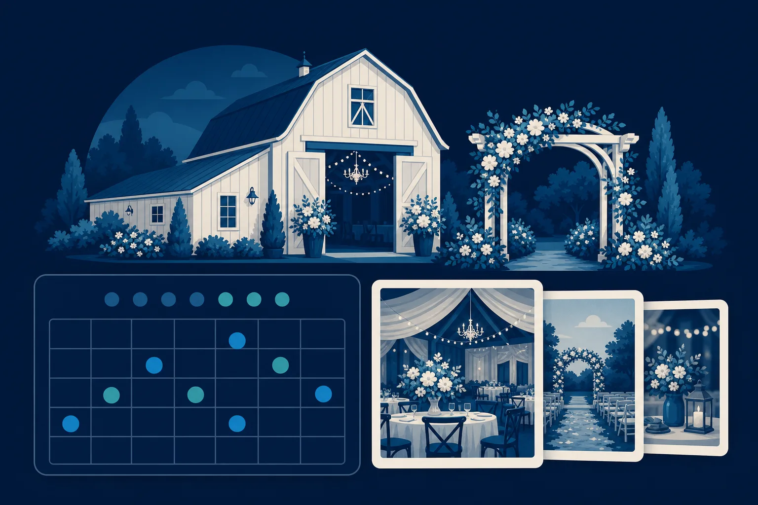
A couple gets engaged on a Sunday night. By Monday afternoon, one of them has a browser tab open with fourteen venues in it. They will visit maybe five of those websites for more than a few seconds, and they will schedule tours at two or three. Your entire job, as a venue owner, is to be one of those two or three.
That is what a wedding venue website is actually for. It is not a brochure. It is the thing standing between a couple who has never heard of you and a Saturday afternoon walk through your property. If you learn how to build a website for a wedding venue that books tours, everything downstream gets easier, because the tour is where you close. Couples fall in love with a place in person. The website just has to get them in the door.
The couple deciding in ninety seconds
Before you touch a single page, understand who is looking. It is usually one person doing the research at night, on a phone, with a dozen tabs open, comparing you against every other barn, ballroom, vineyard, and garden in a fifty-mile radius. She is not reading. She is scanning. And she is making a fast emotional call: can I picture my wedding here, or not.
That means the first thing she sees decides almost everything. A real photograph of your best space, dressed for a wedding, with warm light and actual guests, does more work than any headline you could write. A stock photo of a generic ballroom or, worse, a slow-loading page that shows her a spinning wheel, sends her back to the tab list. She will not wait. There is always another venue.
So the mindset to build around is not "explain the business." It is "help her picture her day here, fast, and make the next step obvious." Every choice below serves that.
Lead with a gallery that sells the feeling
Your gallery is the most important page you have, and most venue websites bury it or fill it with the wrong photos. Fix that.
- Show the space in use, not empty. Empty rooms read as available for rent. Rooms full of guests, string lights, a first dance, a full ceremony aisle read as "this is where weddings happen." Couples buy the feeling.
- Cover the whole arc of a day. Getting-ready suite, ceremony setup, cocktail hour, the reception at golden hour, the sparkler send-off. She is mentally walking her timeline through your property. Give her every stop.
- Show different styles. A rustic couple and a black-tie couple are both shopping you. If your barn can look elegant and your ballroom can look relaxed, prove it with a mix so nobody rules you out.
- Include real weddings with real people. Tag them by season if you can. A couple getting married in October wants to see what October looks like on your grounds, not just June.
Keep the images sharp but fast-loading. A gallery that takes eight seconds to load on a phone is a gallery nobody sees. If you only invest in one thing, hire a photographer to shoot two or three actual weddings across seasons and build the whole gallery from that.
Make packages clear without scaring people off
Pricing is the single most searched thing about any venue, and how you handle it is a real strategic choice. Couples are frustrated by venues that hide everything behind "contact us for pricing," but they are also easily scared off by a big number with no context.
The move that works: show packages, not a single price. Give couples a way to understand what they get.
- Name your packages simply. Something like a weekend package, a weekday or off-season package, and an all-inclusive package. Names help couples self-select before they ever talk to you.
- List what is included in plain language. Hours of access, tables and chairs, setup and cleanup, the bridal suite, parking, an on-site coordinator, whether catering is in-house or open vendor. This is where you answer half their questions before they ask.
- Give a starting-at number or a clear range. You do not have to publish an exact figure for every date. A starting price plus a note that peak Saturdays run higher does two things at once: it qualifies out the couples who could never afford you, so you stop wasting tours on them, and it reassures the ones who can that you are not going to surprise them.
- State your guest capacity for each space. A couple with a 200-person guest list will not book a 120-seat room. Tell them now.
Being upfront here is not giving away leverage. It is filtering. The couples who book tours after seeing your packages are the ones who can actually say yes, and those tours convert far better.
Show availability so couples stop guessing
Here is the pain point unique to your business: dates. A wedding venue sells one thing that never comes back, a specific Saturday. Couples know this, and it drives a quiet anxiety through their whole search. The venue they love might already be taken for their date, and finding that out after a tour feels like a waste of everyone's time.
An availability calendar solves this. Even a simple one that shows which dates or months are open for the next eighteen months changes the conversation. A couple set on a fall wedding can see at a glance that you have three open Saturdays in October, and now the tour is not exploratory, it is urgent. Scarcity that is real and visible is the most honest sales tool a venue has.
If a live calendar is more than you want to maintain, a monthly "dates still open" section you update yourself works. The point is to turn "I wonder if they are free" into "they have my date, I need to lock it in." That urgency is what fills your tour schedule during booking season, which for most US venues means the engagement rush from December through February when a huge share of proposals happen.
Turn the inquiry into a booked tour, not a dead form
Most venue websites end the journey with a sad little contact form: name, email, message, submit. Then silence. The couple has no idea if they will hear back in an hour or a week, and during that silence they are touring your competitors.
Design the inquiry step to actually book the tour.
- Ask for the details you need to qualify and personalize. Wedding date or season, rough guest count, and whether they have a planner. Three fields, not thirteen. Long forms kill submissions.
- Offer specific tour times, not "we will be in touch." Letting a couple pick a Saturday slot themselves converts far better than making them wait for a reply. The couple who books a tour time is ten times more committed than the couple who sends a message into the void.
- Set expectations on the thank-you screen. Tell them what happens next and when. "We will confirm your tour within one business day" beats silence every time.
- Reply fast. No website can fix a two-day response time. Speed of first reply is one of the biggest predictors of who books the wedding, so whatever tool you use, make sure inquiries reach your phone immediately.
Put a "Schedule a Tour" button in the top corner of every single page and repeat it after the gallery and after the packages. The couple should never have to hunt for the way in.
The handful of pages you actually need
You do not need a sprawling site. A wedding venue converts on a tight set of pages, each doing one job:
- Home. One stunning hero photo, your location and setting in a line, and a tour button. Above all, load fast.
- Gallery. Real weddings, organized by space and season.
- Packages and pricing. Clear inclusions, starting numbers, capacities.
- Availability. Open dates, updated often.
- The venue. Your spaces, capacity, the getting-ready suite, parking, rain plan, and whether you allow outside vendors and catering.
- FAQ. The questions you answer on the phone twenty times a week: do you host both ceremony and reception, is there a backup for rain, what time does music have to end, is there overnight lodging nearby, do you require insurance. Answering these builds trust and cuts your inbox.
- Contact and tour booking. The finish line, always one tap away.
Skip the blog, the founder's life story, and the twelve-page vendor directory until the core pages are pulling their weight. Booked tours come from the pages above, not from extras.
Should you build it yourself or have it done
If you are a hands-on person with time in the off-season, a template builder like Squarespace can get a decent venue site up, and its galleries look clean out of the box. Wix and WordPress can also work if you enjoy the tinkering. The honest catch is that wedding season does not leave owners much time, and the parts that actually book tours, fast-loading galleries, an updated availability calendar, a tour-booking flow that reaches your phone, are exactly the parts that get neglected when you are running events every weekend.
If you would rather have it done for you, that is where a service like Saynovo fits: it builds an agency-quality venue site around the photos, hours, and reviews Google already holds, and because your capacities, your packages, and your open dates were never in there, you just tell the site what to change, say "swap the hero for the October wedding and mark those three Saturdays open," and it updates. No logging into a builder at midnight. For a venue owner whose real job is hosting flawless weddings, not maintaining a website, the done-for-you route keeps the site current without stealing your weekends. If you want a larger custom marketing operation, a full agency like the SyntroAI team behind Saynovo can take that on.
Your next step
You do not need a perfect site to start booking tours. You need three things working together: a gallery that lets a couple picture her day, packages and open dates that let her know she can actually have it here, and a tour button she can hit in one tap while the feeling is still fresh.
Start with the gallery. Pull your best real-wedding photos across two or three seasons, get them loading fast, and put a "Schedule a Tour" button beside them. Do that this week, and the couple with fourteen tabs open on Monday night has a reason to make you one of the three she visits.