The short answer
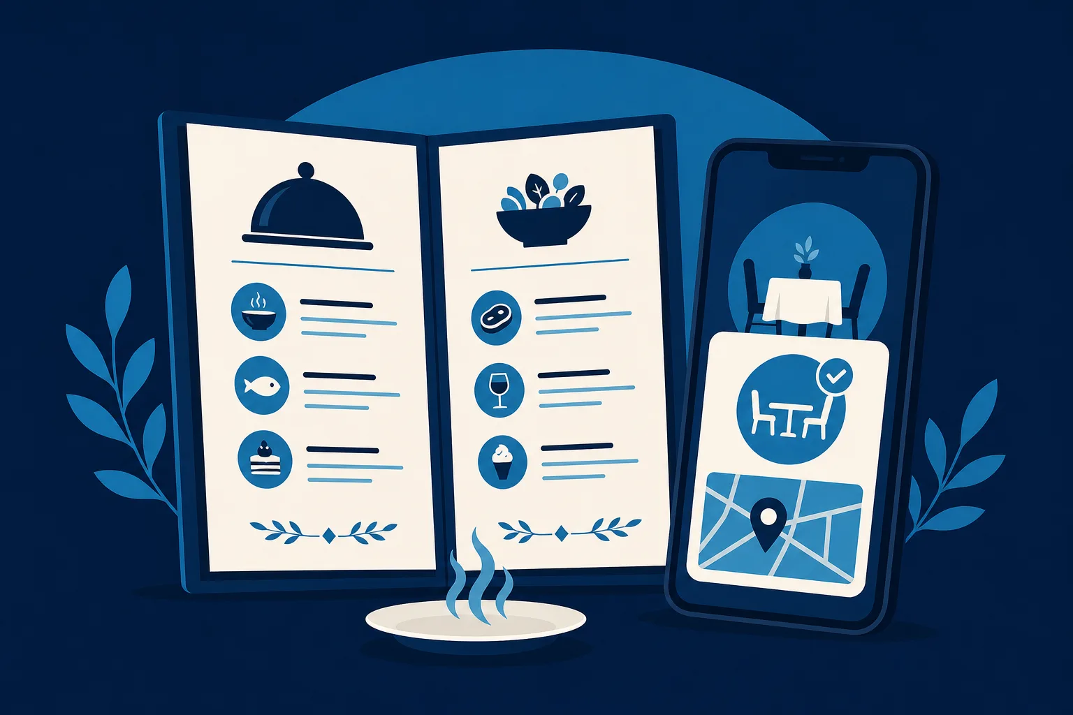
Build a restaurant website that answers three questions in about eight seconds: what you serve, whether you are open right now, and how to get a table. Menu, hours, and a booking or phone link come first.
Most visitors are hungry, in a hurry, and standing on a sidewalk comparing you to the place next door. They are scanning, not reading. So your menu needs to be real text on the page, not a PDF that pinches and zooms on a phone. Hours belong high up and must match what your Google Business Profile says, because a mismatch is the fastest way to lose trust. Photos of actual plates do more work than any paragraph of description.
The answer shifts if you are a booking-heavy dinner restaurant rather than a walk-in lunch spot: then reservations become the first thing on the page and the menu sits just behind it. Seasonal specials and holiday hours change often, so pick a setup you can update yourself in a minute, without emailing anyone.
Most people who visit your restaurant website are hungry, in a hurry, and standing on a sidewalk deciding between you and the place next door. They are not reading. They are scanning for three things: what do you serve, is it open, and how do I get a table. If your website answers those three questions in about eight seconds, you win the table. If it makes them dig, they close the tab and eat somewhere else.
That is the whole job. A restaurant website is not a brochure and it is not an art project. It is a decision machine that takes a hungry person and turns them into someone walking through your door tonight. This guide walks you through how to build a website for a restaurant that actually fills tables, and how to avoid the handful of mistakes that quietly send diners to your competitors every single day.
If you have never had a website before, good. You get to skip an entire era of bad habits and build the thing right the first time.
Start with the one truth about restaurant websites
Here is the uncomfortable part. The single most common feature on restaurant websites is also the single biggest reason people leave: a menu locked inside a PDF.
A PDF menu made sense in 2009. Today, most of your traffic is on a phone. When someone taps your menu link and a PDF opens, it loads as a tiny, zoomed-out page they have to pinch and drag around with two fingers to read a single appetizer. Half of them give up. The other half squint through it and leave annoyed. Google also struggles to read the words inside a PDF, so all those dish names people search for, like "birria tacos near me" or "gluten free pasta downtown," are invisible.
So before we talk about anything else, burn this into your brain: your menu must be real web text on the page, not a file you upload. We will come back to it, because it matters that much.
The four things every diner is hunting for
Everything on a table-filling restaurant website serves one of four jobs. Get these four right and you are ahead of most restaurants in your town.
A real, readable menu
Type your menu directly onto a page as normal web text. Group it the way your kitchen does: starters, mains, sides, desserts, drinks. Under each dish, a short honest description and the price. That is it.
A real HTML menu wins in three ways at once. It reads perfectly on a phone with no pinching. It shows up in Google when someone searches a specific dish. And it is trivial to change when your prices move or a special comes off. Nobody wants to re-export a PDF at 11pm because the fish is 86'd.
A few things that make a menu do its job:
- Put prices on it. A menu with no prices makes people assume the worst and scroll away. Diners want to know if they can afford dinner before they drive over.
- Mark the dietary stuff clearly: vegetarian, vegan, gluten free, spicy. These are the exact words people search and worry about.
- Keep it current. An out-of-date menu is worse than none. If someone shows up expecting the braised short rib you quietly retired, you have created a disappointed customer at your own table.
If you run lunch, dinner, brunch, and happy hour as separate menus, give each its own clearly labeled section or page. Do not staple them into one wall of text.
Hours and location, impossible to miss
This is the question that gets asked more than any other, and the one restaurants hide the most. Your hours and address should be visible without scrolling, and they should be right.
Put your hours where a thumb lands first. Spell out the days plainly. If your kitchen closes an hour before the bar does, say so, because a party that shows up at 9:45 for food when the kitchen shut at 9 becomes a bad review. Note the holidays you close. Mention if brunch is weekends only.
For location, do not just paste an address and walk away. Add a tappable map link that opens directions in one tap, because that is how people actually navigate. If parking is a real thing in your neighborhood, tell them where to park or that you validate or that there is a lot around back. Removing that little friction is the difference between "let's just go" and "let's find somewhere easier."
A way to reserve or order, right now
A hungry visitor is ready to act. Do not make them hunt for the button. Decide what action you actually want and make it obvious.
If you take reservations, a "Reserve a Table" button belongs at the top of every page. Wire it to whatever booking tool you use so the diner picks a time and is done in three taps. Booking a table should never be more than one click away from wherever someone happens to be reading.
If you are a walk-in and takeout spot, the big button is "Order Online" or "Call to Order," with your phone number tappable so a thumb-press starts the call. No copying digits into a keypad.
Plenty of restaurants want both: reserve for the dinner crowd, order online for the weeknight takeout crowd. That is fine. Just make the two buttons distinct and let the diner self-sort. What you must not do is bury either one three clicks deep behind a menu icon.
Photos that make people hungry
Food is the most photogenic product on earth, and restaurants still fill their sites with dark, blurry, greenish plates shot under fluorescent light. Bad food photos do not just fail to help. They actively make good food look sad.
You do not need a professional shoot to start, though it pays for itself fast. A modern phone in daylight near a window will beat almost any flash photo. Shoot your five or six signature dishes, a wide shot of the dining room when it is warm and full, and one of your team doing something real. Bright, close, honest. A little steam, a proper crust, a drink with condensation on the glass. That is what pulls someone off the fence.
Skip the generic stock photos of food you do not actually serve. Diners can smell a fake, and showing a stock steak that looks nothing like your plate sets you up for a letdown at the table.
Fix the classic bad-restaurant-website mistakes
Restaurant websites fail in remarkably consistent ways. Here are the ones that cost you tables, and the fix for each.
- The PDF menu. Covered above, and worth repeating because it is the number one killer. Real text on the page. Always.
- The autoplay music. A saxophone blasting out of someone's phone in a quiet office is an instant close. If you ever had background music on a site, kill it.
- The splash screen or intro animation. The full-screen "Welcome, please choose your language / click to enter" gate is pure friction between a hungry person and your menu. Delete it.
- Wrong or hidden hours. If your Google listing says one thing and your site says another, you lose trust and possibly a customer standing at a locked door. Keep them matched and current.
- Buried phone number. On a phone, your number should be one tap to call. Not an image, not a contact form only. People calling to book a table for tonight will not fill out a form and wait.
- A site that is broken on phones. The majority of your visitors are on a phone, often walking. If your site was built for a desktop and shrinks into an unreadable mess, you are turning away most of your traffic. Mobile is not the afterthought. It is the main thing.
- No prices. Say it plainly. Menus without prices feel like a trap.
If you fix nothing else, fix the menu and the mobile experience. Those two alone put you ahead of the pack.
Match Google to your website, both directions
Before someone ever reaches your website, most of them meet you on Google first: the map pin, the star rating, the hours, the photo. That listing is your Google Business Profile, and it is free. Claim it and fill it out completely, because it is doing a huge amount of your marketing whether you tend it or not.
Two things matter most here. First, the hours and address on Google must match your website exactly. Mismatched hours are how a hungry couple ends up at your dark front door on a Monday you were actually open. Second, link your Google listing to your website and to your booking tool so the "Reserve" button shows up right there in the search result.
This is one place where the whole thing can start almost by itself. If you already have a Google Business Profile with your hours, photos, and phone number filled in, that information can seed a real website without you retyping any of it. Saynovo can import your existing Google Business Profile and generate a live restaurant site around it as your free first version, so your hours, map, photos, and call button are already in place before you have touched a thing. The menu itself was never on Google, so that is the first thing you say out loud. From there you shape it into your real menu and photos.
The pages a table-filling restaurant site actually needs
You do not need fifteen pages. A small, sharp restaurant site usually needs five.
- Home. Your name, one line on what kind of place you are, hours and location up top, the reserve or order button, and three or four mouthwatering photos. A diner should be able to decide from this page alone.
- Menu. Real text, grouped, priced, current. The page most people came for.
- Reservations or Order. Whatever your main action is, given its own clean page with the booking or ordering tool front and center.
- About. A short, human story. Who runs the kitchen, what you are known for, why you opened. This is what turns a one-time diner into a regular, and it is the page food writers and event planners read before they call.
- Contact. Address, tappable phone, map, hours again, and any parking or private-event notes.
If you host private events or do catering, that earns a sixth page, because those are high-value bookings and the people planning them need specifics: capacity, buyout options, a form to inquire.
Seasons, specials, and the stuff that changes
A restaurant is not a plumber. Your website is not a set-it-and-forget-it thing, because your business genuinely changes week to week. A patio opens for summer. A prix fixe appears for Valentine's Day. Thanksgiving hours shift. A dish sells out and comes back.
This is exactly where most restaurant owners get stuck. The site was built by someone else months ago, and changing a single price means emailing a web person and waiting three days, so it never gets done and the site slowly drifts out of date. That is how good restaurants end up with a website that lies about their hours.
The fix is to own the ability to change your own site the moment something changes. On Saynovo you edit by talking to it: say "raise the ribeye to 42," or "add a Sunday brunch menu," or "we are closed July 4th," and it updates. No re-exporting a PDF, no waiting on a developer, no learning software during your dinner rush. For a restaurant, where the menu and hours move constantly, being able to change the site in the time it takes to say the sentence is the whole ballgame.
Should you build it yourself or have it done
Be honest with yourself about time. You are running a kitchen. Here is the straight version.
If you love this stuff and have a slow month, a builder like Wix or Squarespace has restaurant-specific templates with menu blocks and reservation integrations, and you can absolutely put together a solid site yourself over a weekend or two. There is no shame in the DIY route, and for some owners it is the right call.
If your day is already full and the website is the thing that never gets done, get it done for you instead. That is the whole reason done-for-you exists: you describe the place, someone builds the real site, and you keep the ability to tweak it as your menu changes. And if you want the entire marketing operation off your plate, including the site, the listings, and the campaigns that fill your slow nights, that is what a fully-managed agency like SyntroAI handles.
There is no wrong answer. There is only the site that exists and works versus the one you keep meaning to build.
Your next step
Do one thing today: open your restaurant on your own phone the way a hungry stranger would. Search your name, tap through to your menu, and time how long it takes to read tonight's mains and book a table. If it takes more than eight seconds, or if you had to pinch a PDF, or if you could not find your hours, you just watched exactly why some tables sit empty.
Fix the menu first. Make it real text, priced, and readable on a thumb. Then make the reserve or order button impossible to miss, and make sure your hours match Google. Do those three things and your website stops being a digital business card and starts being the reason someone chose your dining room tonight.