A Pilates studio does not fill classes the way a plumber fills a job list. Nobody calls you in a panic at 11pm. Your visitor is usually a woman in her thirties, forties, or fifties who saw reformer Pilates on her phone, decided she wants to try it, and is now quietly deciding whether your studio is the one. She is a little intimidated. She does not know what a reformer is. She is not sure she is fit enough, flexible enough, or young enough. And she will make her whole decision on your website in about ninety seconds, often standing in her kitchen after the kids are down.
If you are opening a studio or you have been running one on an Instagram page and a shared booking link, this guide walks through exactly how to build a website for a Pilates studio that answers her quiet questions and gets her booked into an intro class before she talks herself out of it. No jargon, no assumptions that you already have a site.
Start with the one thing she is actually afraid of
Most Pilates studio homepages open with a slow hero video of someone gliding through a perfect teaser on the reformer. It looks beautiful. It also quietly tells a beginner "this is not for you." She sees a fit, flexible expert and assumes she needs to already be that person to walk in.
Your homepage has to do the opposite. In the first screen a newcomer should read something that says: beginners are welcome, we will show you everything, you do not need any experience. Something as plain as "New to Pilates? Most people in our classes started exactly where you are." That single sentence removes the biggest reason people close the tab.
Then, right under it, one button: Book your intro class. Not "Learn more," not "View our philosophy." The whole point of the page is to move a curious person one inch closer to lying down on a reformer for the first time.
Explain reformer vs mat like she has never heard the words
This is the section that separates a studio website that fills classes from one that just looks nice. A huge share of your first-time visitors genuinely do not know the difference between reformer and mat Pilates, and they will not book something they cannot picture. If you make them feel dumb for not knowing, they leave. If you explain it kindly, they trust you.
Keep it human and short. Something like:
- Mat Pilates is done on a padded mat on the floor, using your own body weight and small props like a ring or light band. It is a great introduction, it needs almost no equipment, and you can do it in a group without ever touching a machine.
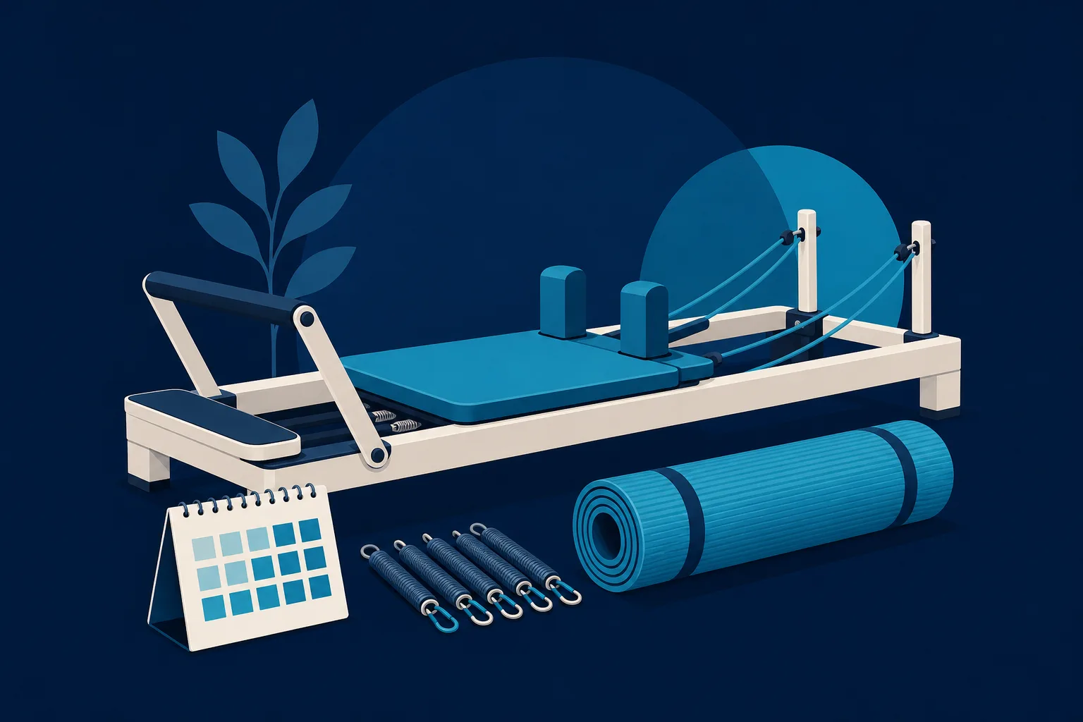
- Reformer Pilates uses a sliding carriage bed with springs, straps, and a foot bar. The springs add gentle resistance and support, so the reformer can actually make movements easier to learn, not harder. It is what most people picture when they see Pilates online, and it is very beginner-friendly with an instructor guiding you.
Then answer the two questions right behind those definitions: which one should a total beginner start with, and is the reformer safe if I am not strong or flexible yet. When you answer those in plain words, you are doing the reassuring that your front desk normally does in person, except now it happens at 11pm while you sleep.
If you offer other formats such as Tower, chair, prenatal, or private sessions, give each a one-line plain-English description too. A newcomer should be able to read your class types and know, without asking, which one has her name on it.
Make the intro offer the front door
Nearly every studio that reliably fills classes has one thing in common: a clear, low-risk intro offer that gets a first-timer through the door once. A single free or low-cost intro class. A "first week" package of two or three classes. A beginner-only session where the whole room is new so nobody feels behind.
Give that offer its own spot on the homepage and its own short page. On that page, spell out the things a nervous beginner is silently wondering:
- What actually happens in the intro class, minute by minute.
- What to wear (grippy socks, comfortable clothes) and whether you sell or lend socks.
- How early to arrive and where to park.
- That the instructor will set the springs and adjust everything for her.
- That she does not need to bring anything or know anything.
The intro offer works because it changes the decision. Instead of "do I want to commit to Pilates," which is a big scary question, she only has to answer "do I want to try one class for almost nothing." That is an easy yes, and the class itself does the selling. Your website's real job is to make that first yes as small and safe as possible.
Put the real schedule on the site, not a dead link
Here is a mistake that quietly costs studios clients: burying the schedule behind a login, a third-party app, or a "call us for times" line. A first-time visitor wants to see, before she commits to anything, that you have a class at a time she can actually make. A 6am before work. A 9:30 after school drop-off. A 5:30 or 7pm for the after-work crowd.
Show a real, readable schedule on your website. At minimum, list your class types and the days and times they run so a visitor can instantly see herself in a slot. Even better, connect it to live booking so she can see what has open spots this week. When someone can look at Tuesday, see a beginner reformer class at 9:30 with three spots left, and grab one in two taps, you have converted a daydream into a booking.
If you run more than one location, keep them clearly separated so nobody drives to the wrong studio. And label the beginner-appropriate classes plainly. A newcomer scanning your grid should never have to guess whether "Reformer Flow 2/3" is going to embarrass her.
Online booking has to be genuinely easy
Online booking is not a nice extra for a Pilates studio; it is the point of the whole site. Wellness clients strongly prefer booking themselves at night, without a phone call, without waiting for you to reply. If booking on your site takes more than about a minute, you lose people at every extra step.
A few things that keep bookings from leaking away:
- Let a first-timer book the intro offer without creating a full account first, or make the account step take seconds.
- Do not ask for a wall of information up front. Name, email, phone, done.
- Show the price and cancellation window clearly so nobody feels tricked.
- Send an instant confirmation email and a reminder before class, so a nervous first-timer does not quietly no-show out of doubt.
- Make the whole thing work on a phone, because that is where nearly all of it happens.
Most studios use a booking and scheduling platform to handle memberships, packages, and waitlists. That is completely fine. The important part is that your website and that booking flow feel like one smooth path, not a jarring hop to a different-looking system that makes her wonder if she is still in the right place.
Photos and proof: show real people, real bodies, real class
Beginners are scanning your photos for one thing: do people like me come here. If every image is a lithe twenty-two-year-old in a flawless pose, you accidentally screen out the exact clients most likely to buy: busy adults trying something new for their body and stress.
Use real photos of your actual studio and a genuine range of real clients. Show a full class in progress, an instructor kneeling next to a reformer helping someone adjust, the clean space, the front desk, the socks by the door. If you can, take them with a decent phone in good daylight rather than downloading stock. Nervous first-timers relax when the place on screen clearly matches the place they are about to walk into.
Then add proof. A handful of short reviews that mention the exact fears newcomers have work far harder than generic five-star praise. A quote like "I hadn't exercised in years and the instructor made me feel completely comfortable" does more to fill a class than any polished tagline. Pull your best few from Google, put them where a hesitating visitor will see them right before the booking button, and keep asking happy regulars to leave more.
The pages a Pilates studio website actually needs
You do not need a sprawling site. A focused studio site is usually just:
- Home - beginners welcome, the intro offer, and a book button, all visible without scrolling far.
- Classes - reformer vs mat vs anything else, explained in plain English, with who each is for.
- Schedule and booking - the real timetable and an easy way to grab a spot.
- Intro offer - the low-risk first visit, with every beginner question answered.
- Pricing and memberships - packages, class passes, and what happens after the intro.
- About - your instructors, their training, and why you opened. People book teachers they trust.
- Contact and location - address, map, parking, hours, and a phone number for the few who prefer to call.
An FAQ page is worth its weight in gold for a studio, because it lets you answer the "am I too out of shape," "I have a bad back," "I'm pregnant," and "what if I'm the only beginner" questions once, in writing, forever.
Getting found by people searching nearby
The good news for a local studio is that you are not competing with the whole internet, just the studios in your town. Two things do most of the work. First, claim and fill out your free Google Business Profile with your correct name, address, hours, class photos, and a link to your booking page; that is how you show up when someone searches "Pilates near me" or "reformer classes" in your area. Second, make sure your website says clearly, in words, where you are and what you offer, so search engines can match you to nearby searchers. A homepage that names your city and neighborhood and describes reformer and mat classes will quietly pull in traffic for months.
Keep your studio name, address, and phone number identical everywhere they appear online. Small mismatches confuse both customers and Google.
The fastest way to get this live
If building all of that sounds like one more thing on top of teaching, cleaning reformers, and managing a schedule, you are not wrong. Most studio owners do not have a spare weekend to wrestle with a website builder, and the intro-class copy and schedule layout are exactly the parts that are easy to get subtly wrong.
This is where a done-for-you option earns its place. Saynovo can build a Pilates studio website for you and then let you change it just by saying what you want. If you decide next month to swap in a "beginner reformer" intro class, or you add a 6am slot, or you want the winter offer swapped for a spring one, you say it and the site updates. There is no dashboard to learn between clients. If your studio already has a Google Business Profile, Saynovo can import it and generate a first version around it for free, so you can see your own studio as a real site before deciding anything. Your schedule, your intro offer, and the reformer-versus-mat explanation were never on Google, so those you say out loud.
If you would rather build it yourself and enjoy the tinkering, Squarespace and Wix both have decent templates and integrations for class booking, and either can absolutely work for a small studio. And if you want the whole marketing engine handled while you focus entirely on teaching, SyntroAI, the agency behind Saynovo, does full-service. The point is not which tool you pick. The point is to stop losing that nervous, curious first-timer to a beautiful video and a dead booking link.
Your next step
Pick the one thing on this list you are missing most right now: a beginners-welcome message up top, a plain reformer-vs-mat explainer, a real intro offer, a visible schedule, or one-minute booking. Fix that one thing this week. That single change is usually the difference between a website that looks like a studio and a website that fills one.