Nobody buys a sofa the way they buy a phone charger. A couch is a big-ticket, sit-on-it, live-with-it-for-ten-years decision, and most people will not commit until they have felt the cushion and seen the color in real light. That is your edge over the giant online-only sellers, and it is exactly why the goal of a furniture store website is not to replace the showroom. It is to fill it.
This guide is about how to build a website for a furniture store that actually drives showroom visits. Not a pretty brochure. A working front door that shows people what you carry, answers the two questions that stop every sale (can I afford it, and how does it get to my house), and gives them a reason to drive over this weekend instead of scrolling past you.
The one job your website has
A shopper researching a $2,400 sectional does not decide on your website. They decide in your showroom. But they decide WHETHER to come to your showroom based on your website. That is the whole game.
So before you think about design, get clear on the single action you want:
- See enough of your inventory to think "they have my style"
- Understand that financing is available and easy
- Trust that delivery is handled and not a headache
- Know exactly where you are and when you are open
- Feel a small nudge to come in this week
Everything on the site should push toward walking through your doors. If a page does not help a local shopper picture themselves in your store, it is decoration.
Show your catalog like a real store, not a spreadsheet
Furniture is visual and tactile. Your website cannot do tactile, so it has to overdeliver on visual. The biggest mistake local furniture stores make is dumping a bare product list on the site, or worse, showing nothing and hoping people just come by.
Organize your online catalog the way a shopper thinks, not the way your supplier ships:
- By room. Living room, bedroom, dining, home office, outdoor. People shop for a space, not a SKU.
- By style. Modern, farmhouse, mid-century, traditional, coastal. Style is how a customer decides you are "for them."
- By price feel. A simple "budget-friendly," "mid-range," "premium" cue helps price-conscious shoppers self-select before they ever walk in.
You do not need real-time inventory or a shopping cart. In fact, most local furniture stores should not try to sell online at all, because delivery, freight, and returns get complicated fast. Think of your catalog as a lookbook: a generous, well-photographed sample of what people will find in the showroom, with a clear line like "come see this and forty more sectionals in person." That gap between "here is a taste" and "the full floor is in the store" is what pulls people in.
Photos are the whole ballgame
If a visitor cannot picture your furniture in their home, nothing else matters. For a furniture store, weak photos are the difference between a full Saturday and an empty one.
Prioritize these shots:
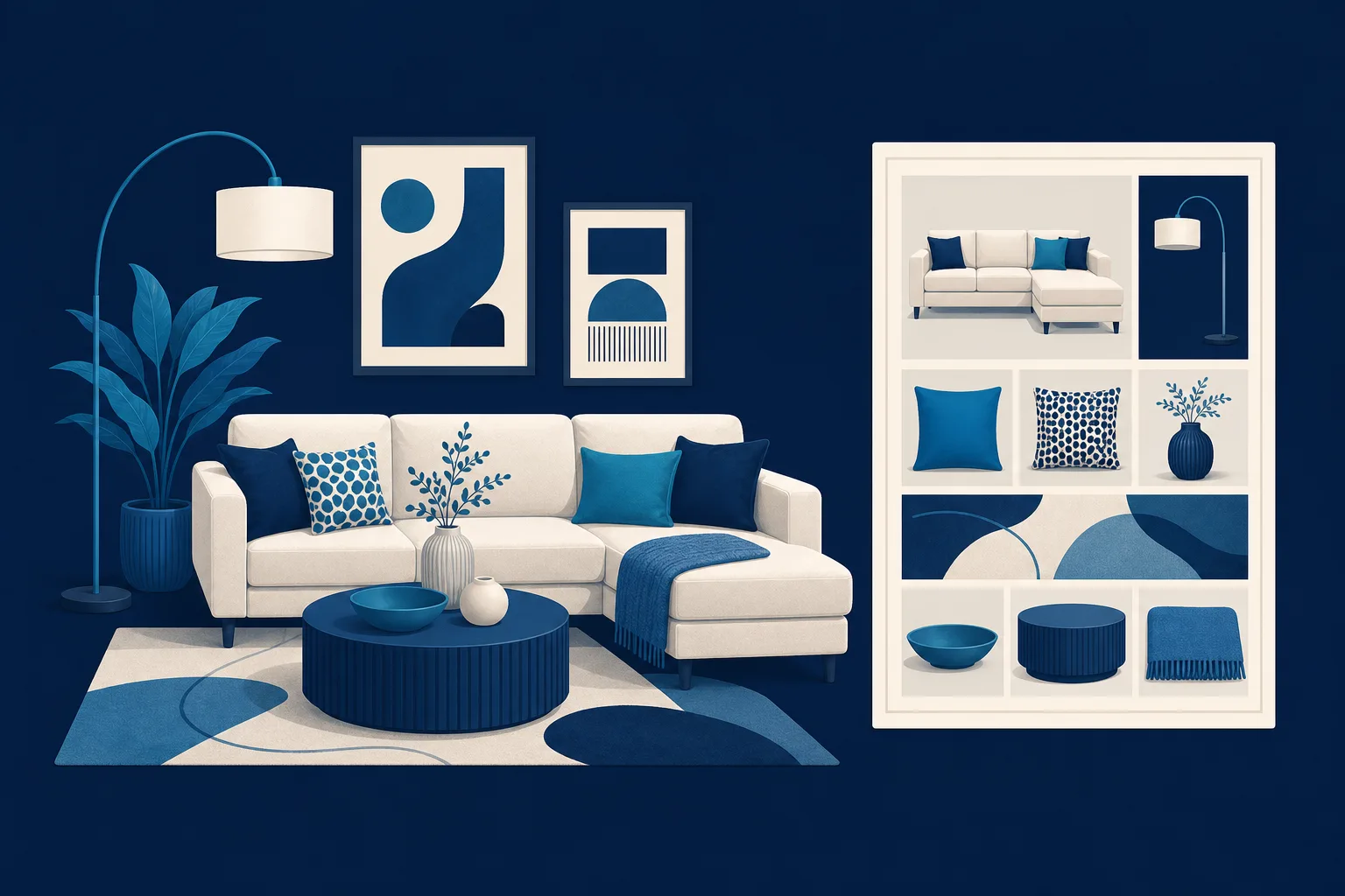
- Styled room scenes, not just the product on a white background. Show the sofa with a rug, a lamp, a coffee table, a plant. People buy the feeling of the room.
- Close-ups of texture: the weave of the fabric, the grain of the wood, the stitching on the leather. This is your stand-in for touch.
- Real showroom photos. A wide shot of your actual floor tells shoppers you are a genuine store with real selection, not a drop-shipper working out of a garage.
- Scale references. A person sitting on the sectional, or a bed made up with pillows, so nobody is guessing whether it fits.
You do not need a pro studio. A clean, bright phone photo of a well-staged corner of your floor beats a stiff catalog render. Shoot near a window on an overcast day, keep the background tidy, and take ten times more than you think you need.
Answer the money question before they ask it
Here is the quiet truth of the furniture business: a huge share of your customers are payment shoppers, not price shoppers. They are not asking "how much is the couch," they are asking "what does this cost me a month, and can I take it home now." If your website hides financing, you lose those people to the big chain across town that plasters "0% financing" on everything.
Put a clear financing page on your site and make it reassuring, not corporate:
- Name the options you offer in plain words: monthly payment plans, lease-to-own, buy-now-pay-later, no-interest promos if you run them.
- Explain who it is for. "Good credit, bad credit, no credit, there is usually an option" removes the shame that stops people from asking.
- Say what to bring and how fast approval is. "Apply in a few minutes, get an answer before you leave the store."
- Be honest and avoid promising numbers you cannot guarantee. You are inviting them in to talk, not signing a contract on the homepage.
The point is not to close the financing on the website. It is to erase the fear that they cannot afford you, so they feel free to come look.
Make delivery feel handled, not scary
The second sale-killer is delivery. A shopper falls in love with a bed, then immediately worries: how does this thing get up my stairs, when, and what will it cost. If your site leaves that a mystery, some people just will not risk the trip.
A short, clear delivery section does a lot of work:
- Your delivery area. List the towns and a rough radius. Local shoppers want to see their own zip code in there.
- What is included. Do you bring it inside, set it up, take the old piece away, haul off the packaging? Say so. White-glove delivery is a selling point, use it.
- Rough timing. "Most in-stock pieces delivered within a week" calms people who assume it is a two-month wait.
- Pickup option. If customers can grab it same day in a truck, mention it for the ones who want it now.
You do not have to publish a price grid. "Delivery quoted per order, ask us in store" is fine. The goal is to replace a scary unknown with a friendly "we handle all of it."
Give them room inspiration, not just products
People rarely come in for one item. They come in because their living room feels off and they do not know how to fix it. If your website helps them imagine the finished room, you become the store that solves the problem, not just a place that sells boxes.
Simple ways to do this without hiring a design team:
- "Shop the room" scenes. One styled photo, then a short list of the pieces in it. "This look: the Harlow sectional, walnut coffee table, and floor lamp, all on our floor now."
- Seasonal refreshes. A spring patio set feature, a cozy fall living room, a guest-room setup before the holidays. Furniture buying has real seasons, and matching your site to them makes you timely.
- Small guides. "How to lay out a small living room" or "picking a dining table that seats your whole family." Short, genuinely helpful, and it quietly answers what people google before they shop.
This inspiration content is also how new local shoppers find you in the first place. Someone searching for room ideas in your town can land on your site, love a look, and realize the store is fifteen minutes away.
Make the visit easy to plan
Once someone decides to come in, do not lose them to a missing detail. This is the part local stores forget, and it is the cheapest to fix.
Put these where nobody has to hunt:
- Address with a map, plus a landmark ("next to the garden center off Route 9")
- Current hours, including weekends and holidays, kept accurate
- Phone number that rings a real person, and a way to text if you offer it
- Parking notes and whether the entrance is easy for a truck or trailer
- A friendly "no pressure, come browse" line, because plenty of people avoid furniture stores expecting a pushy salesperson
If you offer it, an option to book a design consultation or reserve a one-on-one showroom appointment gives serious buyers a reason to commit to a time, which turns a "maybe someday" into a Saturday at 11.
Get found by local shoppers
A beautiful site that nobody sees is a poster in a closet. For a furniture store, most of your traffic should come from people nearby searching things like "furniture store near me," "sectionals in [your town]," or "sofa financing [your area]."
The basics that move the needle:
- Claim and fill out your Google Business Profile completely, with real showroom photos and correct hours.
- Use your city and neighborhood names naturally on your pages, especially on the delivery and contact sections.
- Ask happy customers for reviews and mention your best ones on the site. For big purchases, social proof does heavy lifting.
- Make sure the site loads fast and looks right on a phone, because that is where nearly all of this shopping starts.
Getting it built without the headache
You have two honest paths. If you enjoy tinkering and have the hours, a builder like Squarespace or Wix can get a decent furniture catalog online yourself, and there is no shame in that. If you want more control and plan to add real e-commerce later, WordPress can grow with you, though it is more to maintain.
But most furniture store owners are running a floor, managing deliveries, and chasing suppliers. They do not have a weekend to fight a page builder, and they definitely do not have time to rebuild the site every time a new collection lands or a holiday sale starts. That is the real problem: a furniture site is never "done," because your floor changes.
This is where a done-for-you approach fits. Saynovo builds your furniture store an agency-quality site from what is already on your Google Business Profile, so your first version costs you nothing to see. From there, the difference that matters for a busy store owner is how you update it: you just say what you want. "Add the new fall living room collection to the homepage," or "put a 0% financing banner up through Labor Day," or "swap in the photos from the sectional we just got in," and the site changes. No dashboard, no tickets, no waiting on a web guy. If you would rather hand off the whole thing and never think about it, SyntroAI, the agency behind Saynovo, can run it as a fully managed website for you.
The point is not the tool. The point is that your website should work like your best salesperson: showing off the floor, easing the money and delivery worries, and getting people to come sit down. Pick whichever path gets you there and keeps the site current, because a stale furniture site sends people straight to the chain store.
Your next step
You do not need a perfect website. You need one that makes a local shopper think "that is my style, I can afford it, and getting it home is easy," then tells them exactly when you are open. Start with three things this week: photograph five styled corners of your showroom, write a plain-English financing paragraph, and put your delivery area and hours where nobody has to search. Do that, and your website stops being a brochure and starts filling your floor.