Most guides on how to choose fonts for a website hand you a gallery of pretty typefaces and wish you luck. That is the wrong place to start. A font is not decoration. It is the thing your customer reads before deciding whether to call you, book you, or close the tab. Pick badly and a solid business looks amateur. Pick well and a small local shop looks like it has a design team behind it.
This guide is for the owner who is not a designer and does not want to become one. You will learn how to pick fonts that read clearly, load quickly, match the kind of work you do, and hold up on a phone screen. Roughly half of what follows works no matter what tool you build your site in.
Start with the job, not the look
Before you browse a single font, get clear on what the font has to do. A typeface that looks charming on a poster can be miserable to read in a long paragraph. Split your thinking into two jobs.
- The headline job. Big text at the top of a page: your business name, your main promise, your section titles. This text can carry personality because people read it in short bursts.
- The body job. The paragraphs, the service descriptions, the fine print. This text has one duty above all others, which is to be effortless to read for someone skimming on a phone during a lunch break.
Almost every good website solves these two jobs with a maximum of two fonts. One for headlines, one for body. Sometimes a single well-built family does both. The moment you reach for a third or fourth font, the page starts to feel like a ransom note and your credibility drops.
The five things that actually matter
Pretty is subjective. These five qualities are not. Judge every font against them.
1. Readability at small sizes
Read a full paragraph of real text at the size body copy actually appears, somewhere around 16 to 18 pixels. Do not judge a font by its name shown huge. Watch for letters that blur together, a lowercase that looks cramped, or numbers you have to squint at. A font with a taller lowercase, which designers call a generous x-height, tends to stay legible when it shrinks.
2. A clear split between look-alike letters
Some fonts draw a capital I, a lowercase l, and the number 1 almost identically. On a page full of phone numbers, prices, and addresses, that is a real problem. Type the string Il1 and O0 and check that you can tell them apart instantly. Home services sites live and die on a phone number being read correctly.
3. Enough weights to build a hierarchy
A weight is the thickness of the strokes. You want at least a regular and a bold, and ideally a medium in between. Weights are how you make a headline feel important and a caption feel quiet without switching fonts. A font that ships only one weight will box you in fast.
4. Real italics, not fake slanting
Good fonts include a drawn italic for emphasis. Cheaper or free-in-a-hurry fonts fake it by tilting the upright letters, which looks slightly off even if the reader cannot say why. If you plan to emphasize words, confirm a true italic exists.
5. It survives on a phone
More than half of local business traffic is on a phone held at arm's length in bad light. Whatever you shortlist, look at it on an actual phone before you commit, not just your laptop. A font that feels elegant on a big screen can turn thin and faint on a small one.
Serif or sans serif: a simple way to decide
You do not need the full history of typography. You need one honest read on the feeling you want.
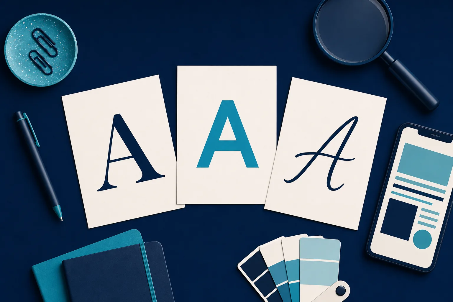
- Serif fonts have little feet on the ends of the strokes. They read as established, careful, and traditional. They suit a law office, an accountant, or a restoration company that wants to signal decades of experience.
- Sans serif fonts have no feet. Clean and plain. They read as modern, direct, and approachable. They suit most home services, wellness studios, and anything that wants to feel current and no-nonsense.
- Script and decorative fonts imitate handwriting or lean hard into a mood. Use these only for a logo or the occasional headline, never for paragraphs. They are seasoning, not the meal.
A dependable pattern for a local business: a sans serif for everything, in two or three weights. It is hard to make it look wrong. If you want more character, pair a serif for headlines with a sans serif for body, or the reverse. That contrast reads as intentional.
How to pair two fonts without a design degree
Font pairing sounds like a dark art. It is mostly two rules.
- Pair by contrast. Combine two fonts that clearly differ, such as a bold sans serif headline over a serif body. The difference should be obvious. Two fonts that are only slightly different look like a mistake rather than a choice.
- Pair by family. Many modern fonts ship as a family with a matching serif and sans serif built to sit together. Using two members of one family is the safest pairing on earth because someone already did the hard part.
When in doubt, do not pair at all. One strong font in several weights beats a clumsy pairing every time.
A quick test: cover the fonts and ask a friend to describe the business in three words based only on the shapes. If the words match how you want to be seen, you chose well.
The parts nobody tells small business owners
Here is where most font advice stops and where sites quietly fall apart. These points rarely appear in the popular guides, and they matter as much as looks.
Loading speed is part of the choice
Every custom font is a file your visitor's phone has to download before the text appears. Load four fonts, or one font in eight weights, and you add real delay. Slow text costs you visitors who leave before the page settles, and it drags down how search engines rank you. Two rules keep you safe: use no more than two font families, and load only the specific weights you use. If you are not using the thin or the extra-black weight, do not ship them.
Set a fallback so text never vanishes
While a custom font downloads, the browser needs something to show. If you do not tell it what, visitors can stare at blank space for a beat. The fix is to name a common backup font of the same style, so ordinary system fonts fill in for the split second before yours arrives. It is a small setting with an outsized effect on how fast a page feels.
Contrast and accessibility are not optional
A font can be perfect and still be unreadable if it is pale gray on white, set too small, or squeezed too tight. Aim for strong contrast between text and background, keep body text at a comfortable size, and give paragraphs room to breathe with generous line spacing. This is not only courtesy to older customers or anyone with low vision. It is also how you avoid losing someone who simply could not be bothered to strain. Clear type is good manners and good business at the same time.
Check the license before you fall in love
If you download a font from somewhere random, you may not have the right to use it on a commercial site. Stick to libraries that are free for commercial use, such as Google Fonts, or fonts you have properly licensed. A legal notice over a typeface is a headache no local business needs.
Test with your own words
Sample text is a trap. A font can look wonderful spelling out the alphabet and then stumble on your actual business name, your city, or your longest service. Paste in your real headlines, your real phone number, your longest paragraph, and the awkward street name in your address. Judge the font on the words your customers will truly read.
How to choose fonts for a website in seven steps
If you want a plan rather than a lecture, do this in order.
- Decide the feeling in one word: established, modern, warm, or premium.
- Pick one sans serif that reads cleanly at small sizes and has at least three weights.
- Decide whether you even need a second font. Often you do not.
- If you do, add one contrasting headline font, or use a matching family member.
- Load only the weights you use, and name a system fallback.
- Paste your real content in and read it on a phone.
- Check contrast and size for someone who is not looking hard.
Follow those seven steps and you will land ahead of most local competitors, who tend to accept whatever default their website builder handed them.
When you would rather not fiddle with any of this
Plenty of owners read all of the above and think, I run a roofing crew, I do not want to audition typefaces. That is fair. This is one place where a done-for-you approach earns its keep. Saynovo builds a business its own website and settles on a font system to fit it as part of that build, so the headline and body pairing, the weights, and the fallbacks are handled rather than left as homework. If you later decide the headings feel too formal or too loud, you say so in plain words and the type changes, no font menus required. For owners who want a considered look without learning typography, letting the pairing be decided for you removes a step that trips up a lot of small sites.
The short version
Knowing how to choose fonts for a website comes down to a few honest checks rather than taste. Solve the headline job and the body job with at most two fonts. Test readability at real sizes, on a real phone, with your real words. Load only what you use and set a fallback so nothing disappears. Keep contrast strong so everyone can read it, and confirm you are allowed to use the font at all. Do that and your type will quietly do its job, which is to get out of the way and let a customer decide to hire you.
Sources worth reading next:
- Choosing Web Fonts, a Beginner's Guide from Google Design
- How to Choose Website Fonts from Squarespace
- How To Choose The Right Font For Your Website from CareerFoundry
- How to Choose the Best Fonts for Your Website from Wix