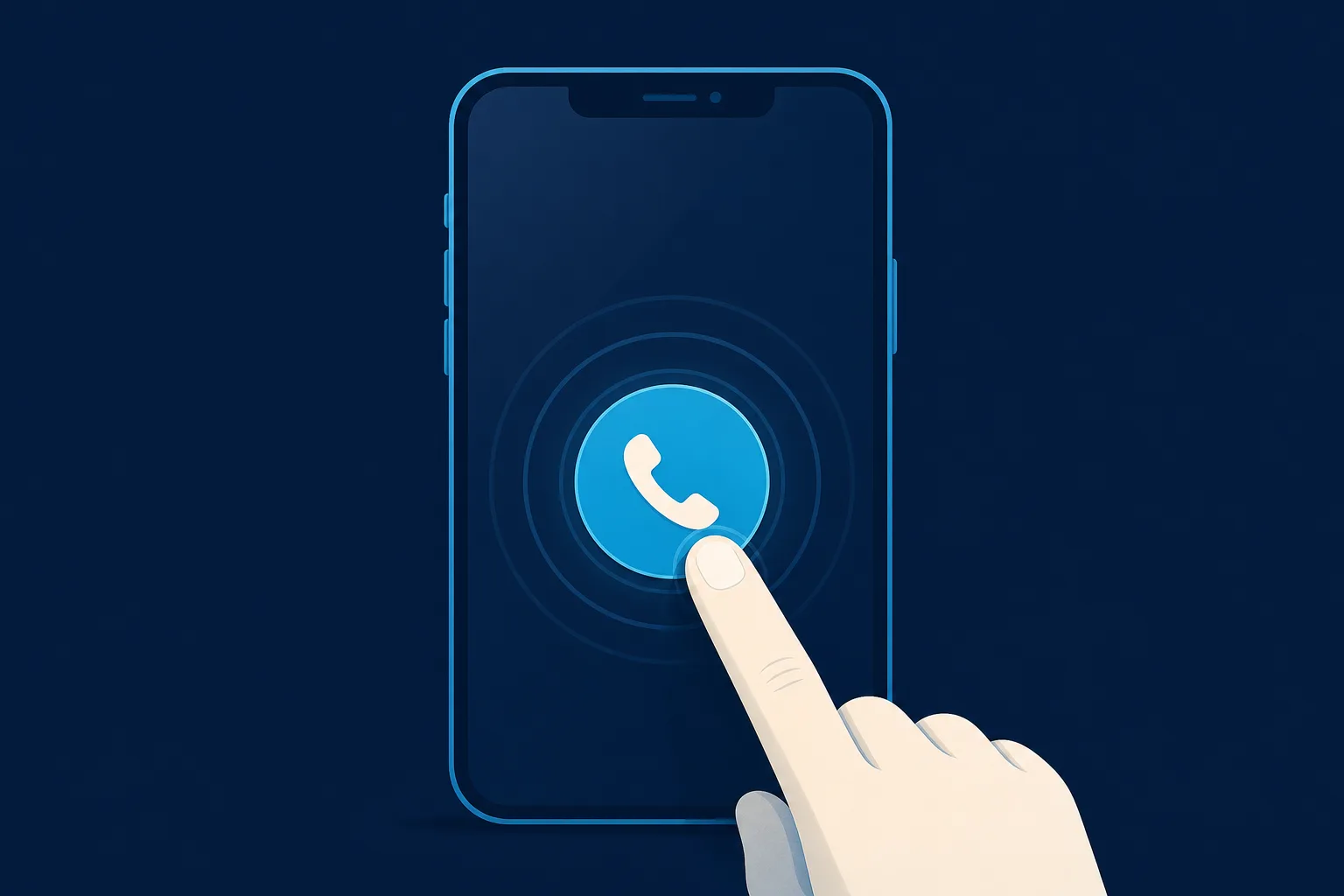
A click to call button on website pages does one small thing very well: it turns your phone number into a link that a visitor taps once to start a call. No copying digits, no switching apps, no squinting at a footer. For a local business that lives on phone calls, that single tap is often the difference between a booked job and a bounce.
This guide walks through the actual setup, the parts most tutorials skip (extensions, accessibility, testing on real phones), and how to know whether the button is earning its place. Most of it applies no matter what tool or platform you use.
Why phone calls still matter for local businesses
If you run a roofing crew, an HVAC company, a restoration outfit, or a wellness studio, your customers often want to talk to a human before they commit. Someone with a leaking roof at 7pm is not filling out a contact form and waiting two days. They want to hear a voice.
Calls also tend to be higher intent than form fills. A person who dials your number has already decided they want help now. That is why so many owners treat the phone as their main sales channel and everything else on the site as a way to get people to pick it up.
The catch is friction. On a phone screen, a plain printed number forces the visitor to memorize it, leave your site, open the dialer, and type it in. Every one of those steps loses a few people. A tap-to-call link removes all of them.
What a click to call button actually is
Under the hood, this is not complicated. A normal web link points to a web address. A call link points to a phone number using a small piece of standard code called the "tel" protocol. When someone taps it on a phone, the operating system recognizes the number and opens the dialer with your number already filled in.
The link has two parts:
- The destination, written as the word tel, a colon, and your phone number in international format (country code included, no spaces or dashes).
- The visible text or button the visitor actually sees and taps, such as "Call us" or your formatted number.
So the machine-readable part might read tel:+15551234567 while the part your customer sees reads Call (555) 123-4567. The visible version can be pretty and human-friendly; the hidden version has to be strict and clean.
The number format that avoids dropped calls
This is the single most common place people get it wrong, and it rarely shows up until a customer complains.
Always write the number in the link using full international format. That means a plus sign, then the country code, then the full number, with no brackets, spaces, dashes, or dots. For a United States number that looks like +15551234567. For a United Kingdom number it looks like +442071234567.
Why be this strict? Because a growing share of visitors are on mobile networks that route differently, are traveling, or use a phone set to another region. A number written the loose local way (just the seven or ten digits) can fail for those people even though it works fine on your own phone. The international form works everywhere, so use it every time even for a purely local audience.
One more detail: the visible text does not have to match the strict format. Show people the friendly, readable version. Keep the strict version in the link itself.
Handling extensions and menus
Most guides stop at the basic number, which leaves out anyone who needs to reach a specific desk. If your calls go through an extension or an automated menu, you can build that into the link so the phone dials it for the visitor.
Two special characters help here:
- A comma inserts a short pause, usually about two seconds. Use it to wait for a menu to start talking before sending the next digits.
- A semicolon marks digits the phone should wait to send until the call connects and the menu is ready.
So a link can dial your main line, pause, and then punch an extension automatically. Support for this varies a little between phone models, so if extensions matter to your business, test the exact link on a couple of real devices before you rely on it.
Where to put the button so people actually use it
A call link that nobody sees may as well not exist. Placement matters more than styling.
- Top of the page. Put a tappable number in the header so it is visible the moment someone lands, without scrolling.
- A sticky or floating button. A small button that stays on screen as the visitor scrolls keeps the call option one thumb-reach away at all times. This tends to work well on phones where screen space is tight.
- Near every call to action. Wherever you ask people to book, quote, or schedule, offer the call option right beside it. Some people will always prefer talking over typing.
- The footer. Not a substitute for the above, but a reliable fallback for people who scroll all the way down looking for contact details.
Make the tap target big enough for a thumb. A good rule is at least a 44 by 44 pixel area so people do not have to aim. Add a small phone icon and use a color that stands out from the rest of the page so the button reads as clickable, not as decoration.
Desktop visitors: what happens when they click
Phones are the main event, but desktop clicks should not break. On a computer, tapping a call link does not ring a phone. Instead the browser usually asks which app should handle it, or opens whatever calling software is installed, such as a video-call or voice app. Sometimes nothing obvious happens at all.
That is fine as long as you plan for it. Keep the number readable as text next to or inside the button so a desktop visitor can still see it and dial from their own phone. Never hide your number behind an icon only, because a desktop user who cannot click through has no way to reach you.
Accessibility: the part almost everyone skips
A button that works for a screen reader user is a button that works for everyone, and it is easy to get right.
- Use real link text, not just an icon. If the button is only a phone symbol, add a hidden label so assistive technology announces something like "Call our office" rather than "link."
- Describe the action. "Call us at 555 123 4567" tells the visitor exactly what tapping does. Vague labels like "click here" help no one.
- Keep good color contrast. The button text needs to stand out clearly against its background so people with low vision can read it.
- Make it reachable by keyboard. A proper link is focusable and can be triggered without a mouse. Custom buttons built the wrong way sometimes lose this, so check that you can tab to it and activate it with the keyboard.
These small choices also happen to make your button clearer for every hurried, distracted, one-handed visitor, which is most of them.
How to test it before you trust it
Do not assume it works because it looks right on your laptop. Run through this quick checklist on real hardware:
- Open the live page on an actual phone, not just a desktop browser preview, and tap the button. The dialer should open with the correct number filled in.
- Test on both a modern iPhone and an Android phone if you can. Behavior differs slightly between them.
- Confirm the number that appears is complete and correct, including the country code.
- If you use an extension or menu pause, place a real test call all the way through.
- Check that the button is visible without zooming and that your thumb hits it easily.
A call button that dials the wrong number, or a number missing a digit, is worse than no button at all. It quietly sends motivated customers to a dead end. Test it the day you add it, and again any time you change your number.
Knowing whether the button is working
Adding the button is step one. Knowing if it earns calls is step two, and it is where you decide what to improve.
Most analytics tools let you record a click on a call link as an event. Set that up so you can see how many people tap to call each week and which pages drive the most taps. Compare that against your actual booked jobs to get a feel for how many taps turn into real conversations.
A word of caution: a tap is not always a completed call. People change their minds, misdial, or hang up. Treat click counts as a signal of interest, not a promise of revenue, and lean on what your team actually hears on the phone to judge quality.
A simpler path if code is not your thing
If editing your site's markup, hunting for the HTML panel, and testing tel links across devices sounds like a chore, you are not alone. Plenty of owners just want the number to work and the button to look right without touching code.
That is one of the small things Saynovo takes off your plate. When it builds your site from your Google Business Profile, it reads the phone number you already listed there and wires up a proper tap-to-call button for you, formatted correctly and placed where mobile visitors will see it. If your number ever changes, you tell the site in plain language and it updates, so you are not back in a code editor chasing a broken link. It is a done-for-you approach aimed at local and home-services owners who would rather answer calls than manage markup.
The short version
A click to call button on website pages is one of the highest-return, lowest-effort changes a local business can make. Get three things right and you are ahead of most competitors:
- Write the number in the link using full international format so it works for everyone.
- Place a big, obvious, thumb-friendly button where mobile visitors see it without scrolling, and keep the number readable for desktop.
- Test it on real phones and track the taps so you know it is doing its job.
Do that, and the next person with an urgent problem gets to you in a single tap instead of giving up and calling someone else.